Broken assumptions.
The acquisition flow assumed people already knew which product fit their situation, how to compare options, and what mattered early versus later. In practice that meant anxiety at the front door, people choosing the wrong product, and drop-off later when expectations didn't match outcomes. Misrouted leads also cost sales teams time.
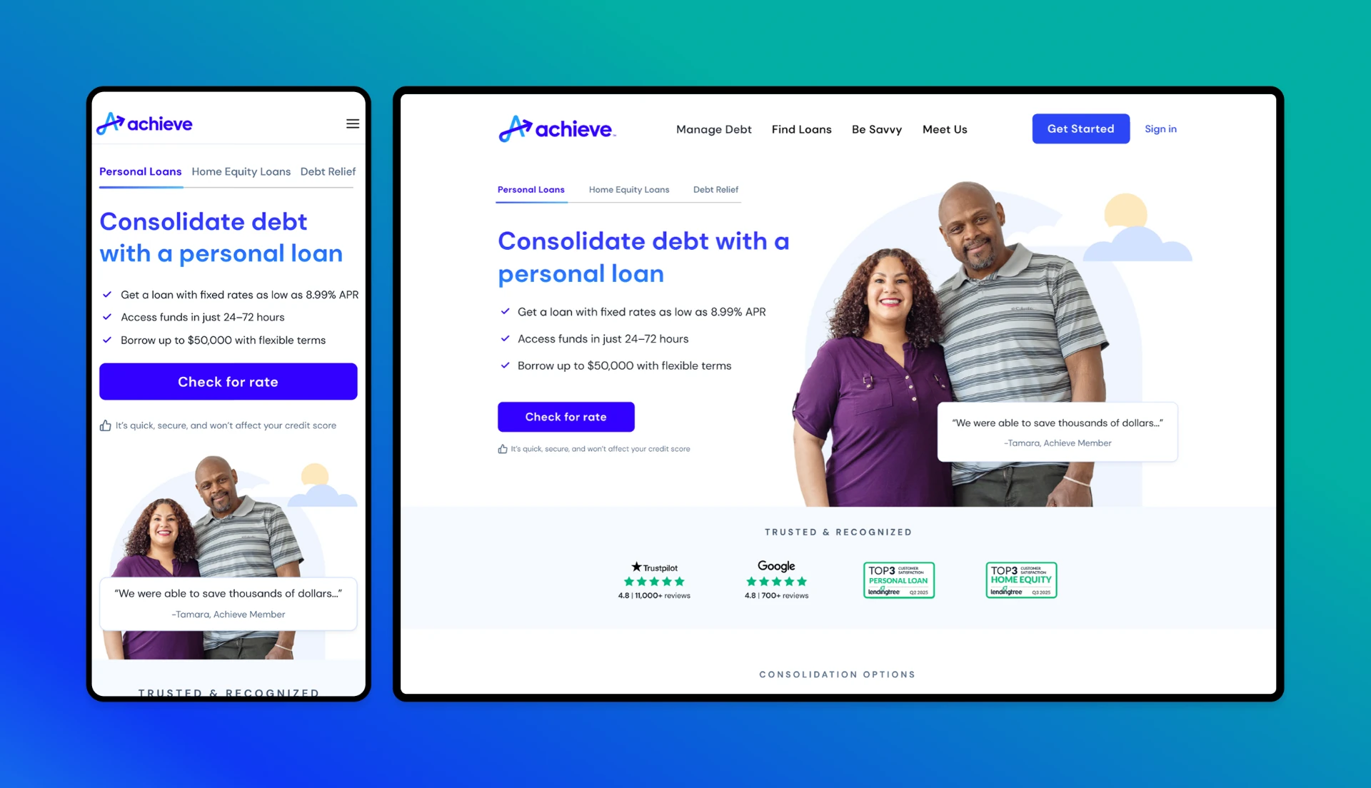
The previous homepage.
It lacked credibility signals, led with debt relief over loans, and didn't route people with strong credit toward the right paths.
Grounded in evidence.
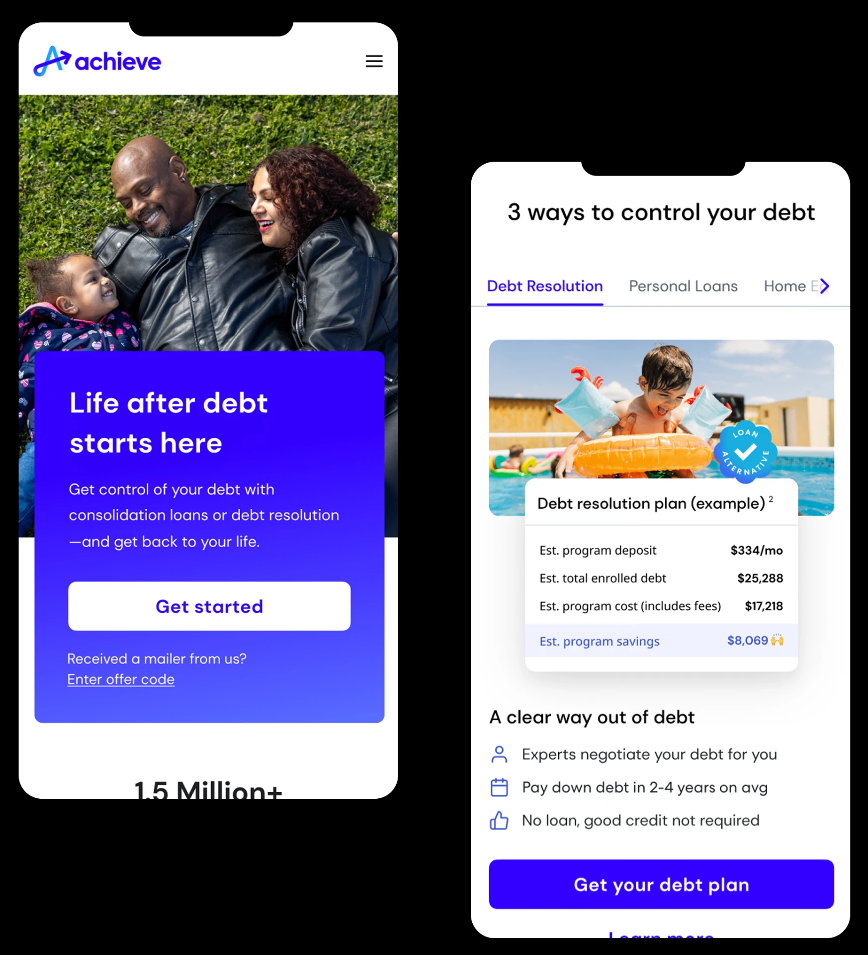
Funnel analytics and drop-off patterns, lead routing data and downstream outcomes, user testing on comprehension and confidence, and insights from sales and servicing teams.
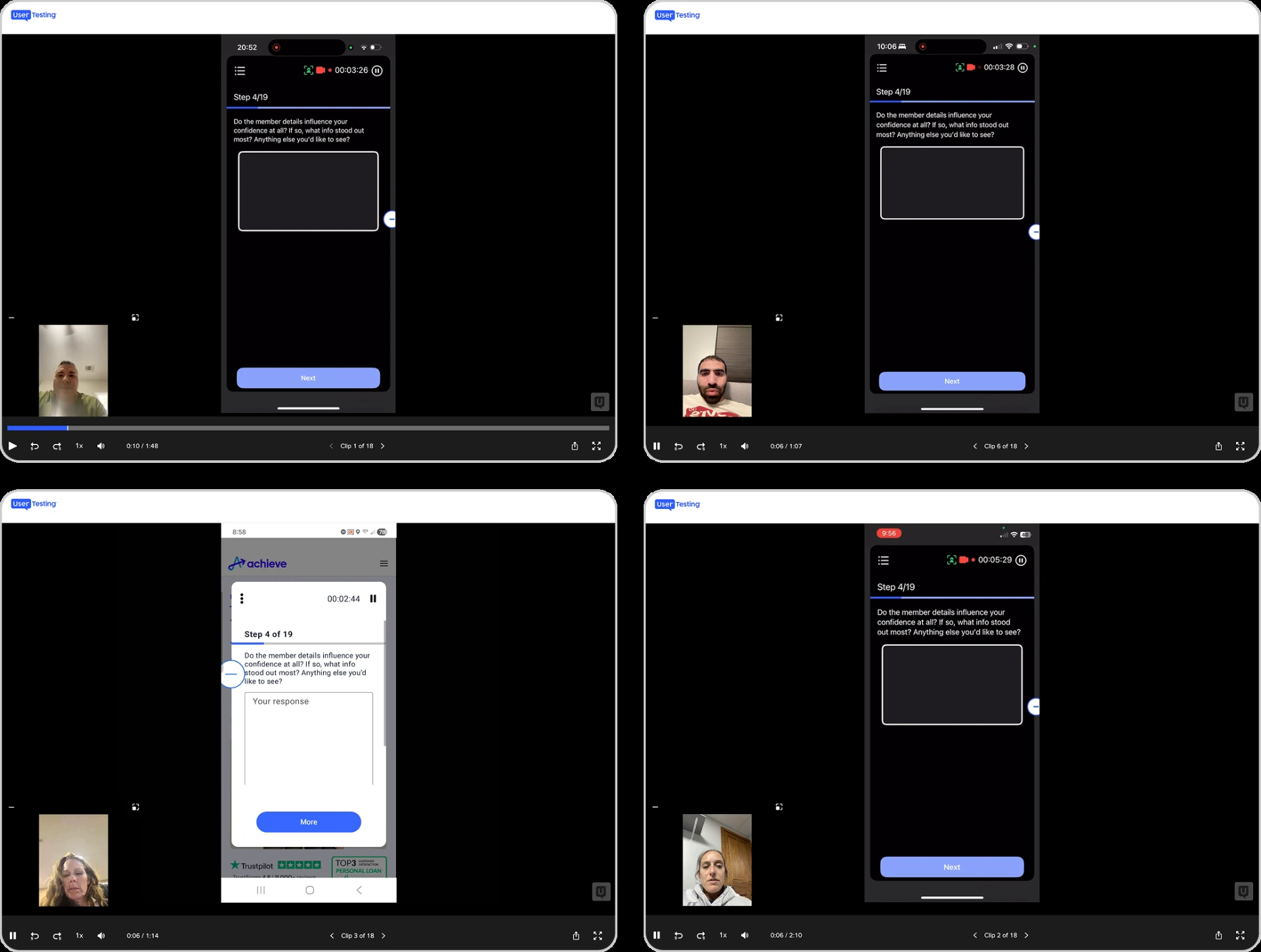
Testing showed confusion about how the products differed and who was eligible.
Acquisition as a system of decisions, not a single page.
A guide, not a salesperson.
People arrived without knowing where to start. The homepage set expectations early, signaled that help would be personal, and invited exploration instead of forcing a commitment.
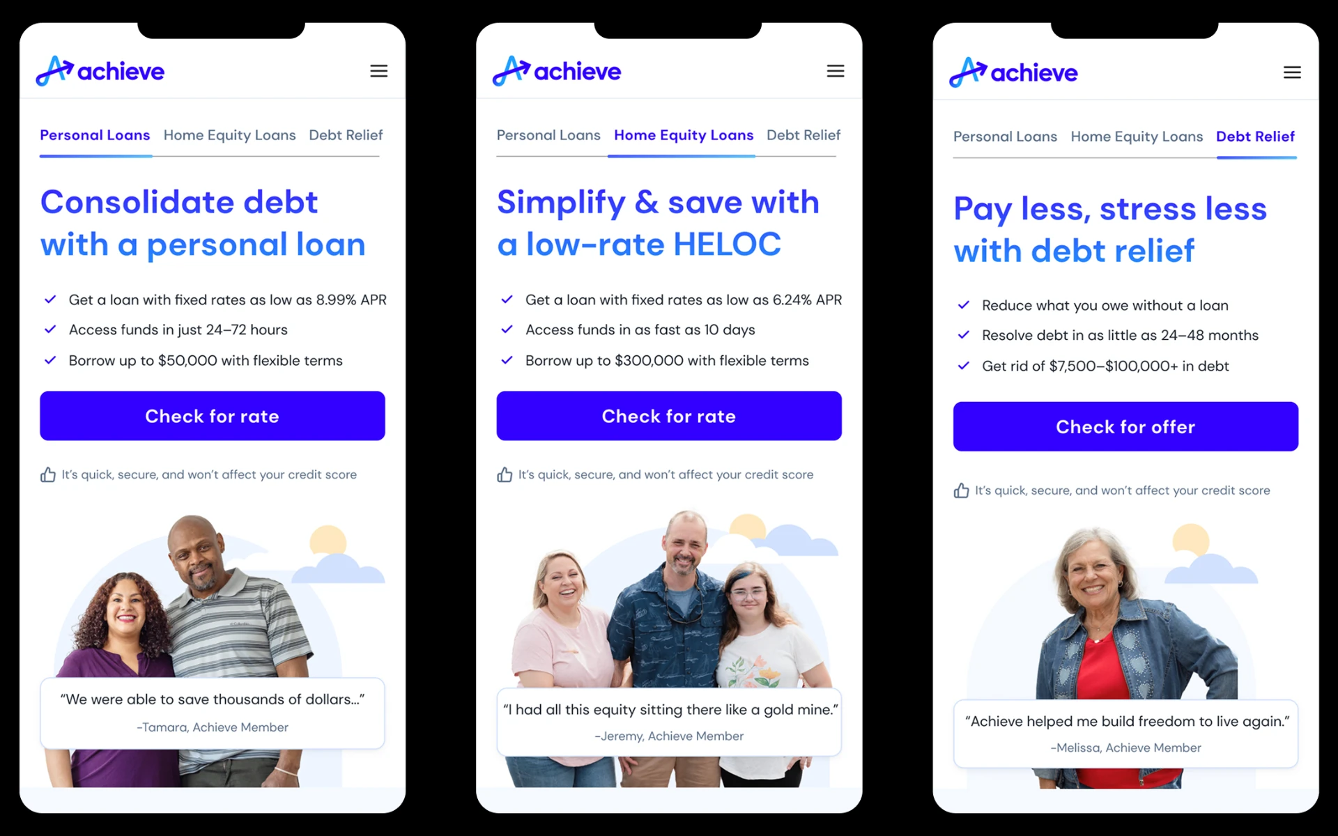
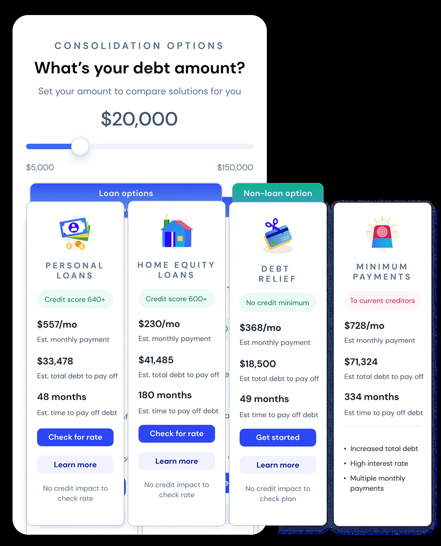
Comparison as a guardrail.
People wanted to compare, but self-diagnosis led to misrouting. Grouping options as "loans" and "non-loan option" and framing them in human terms made the differences clear.
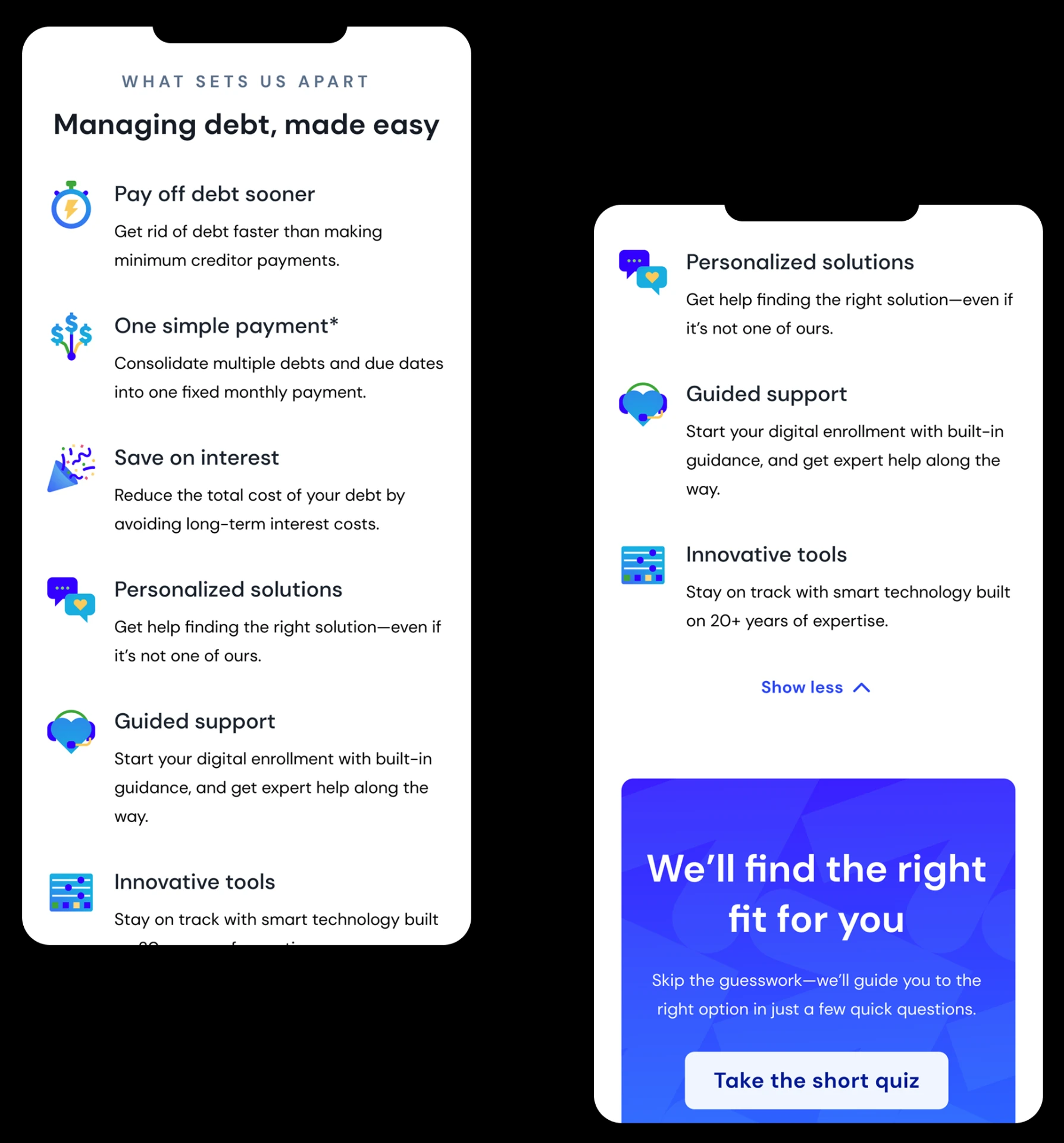
Why this exists, and who it's for.
Research showed "why choose us" was missing. Modular value props explained each product and deferred complexity until people were ready.
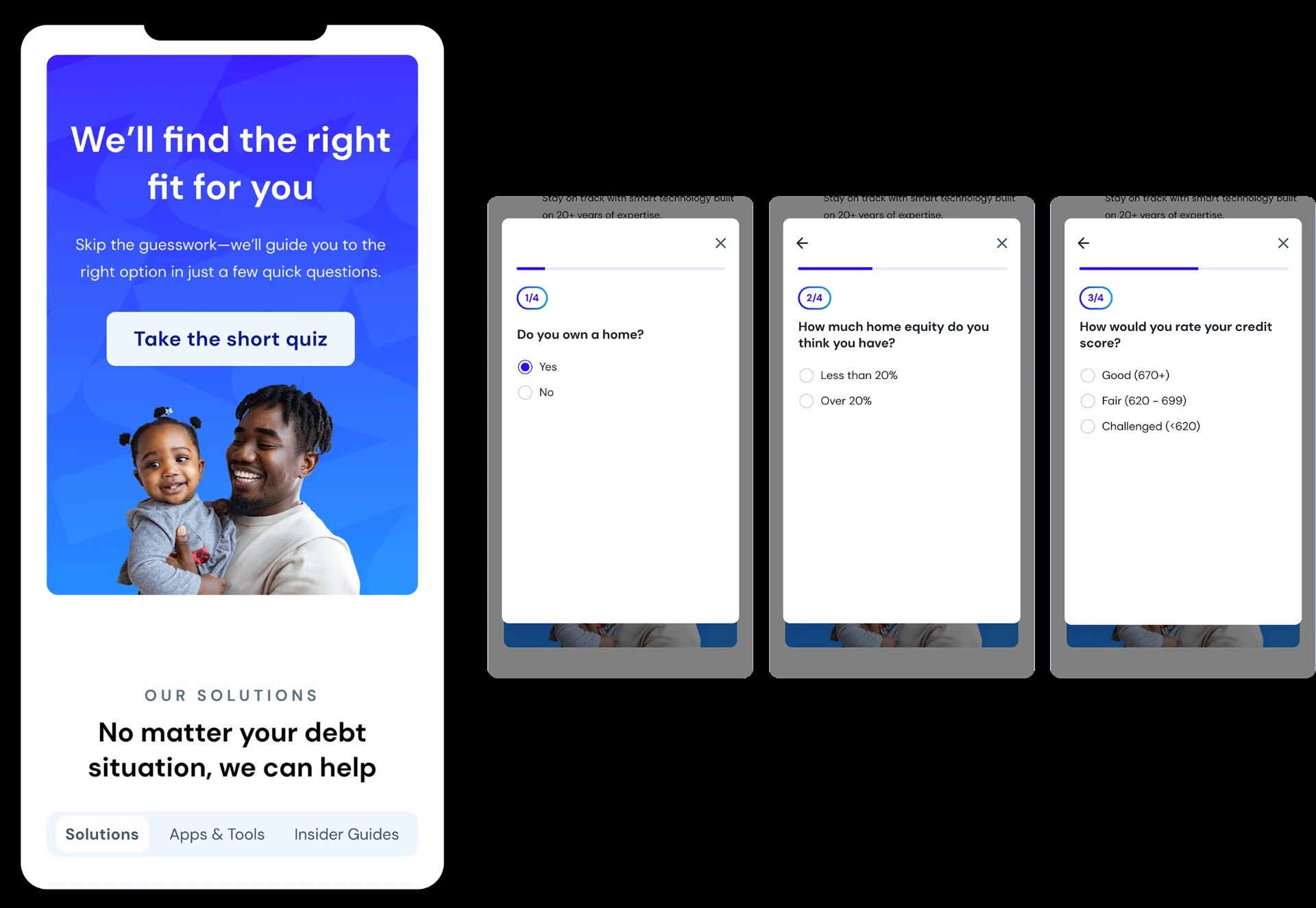
Four questions. Sixty seconds.
A light, emotionally safe quiz became the routing layer, ending in a result card with one recommendation, a simple reason and a single next step.
90% stated click intent among unconverted users
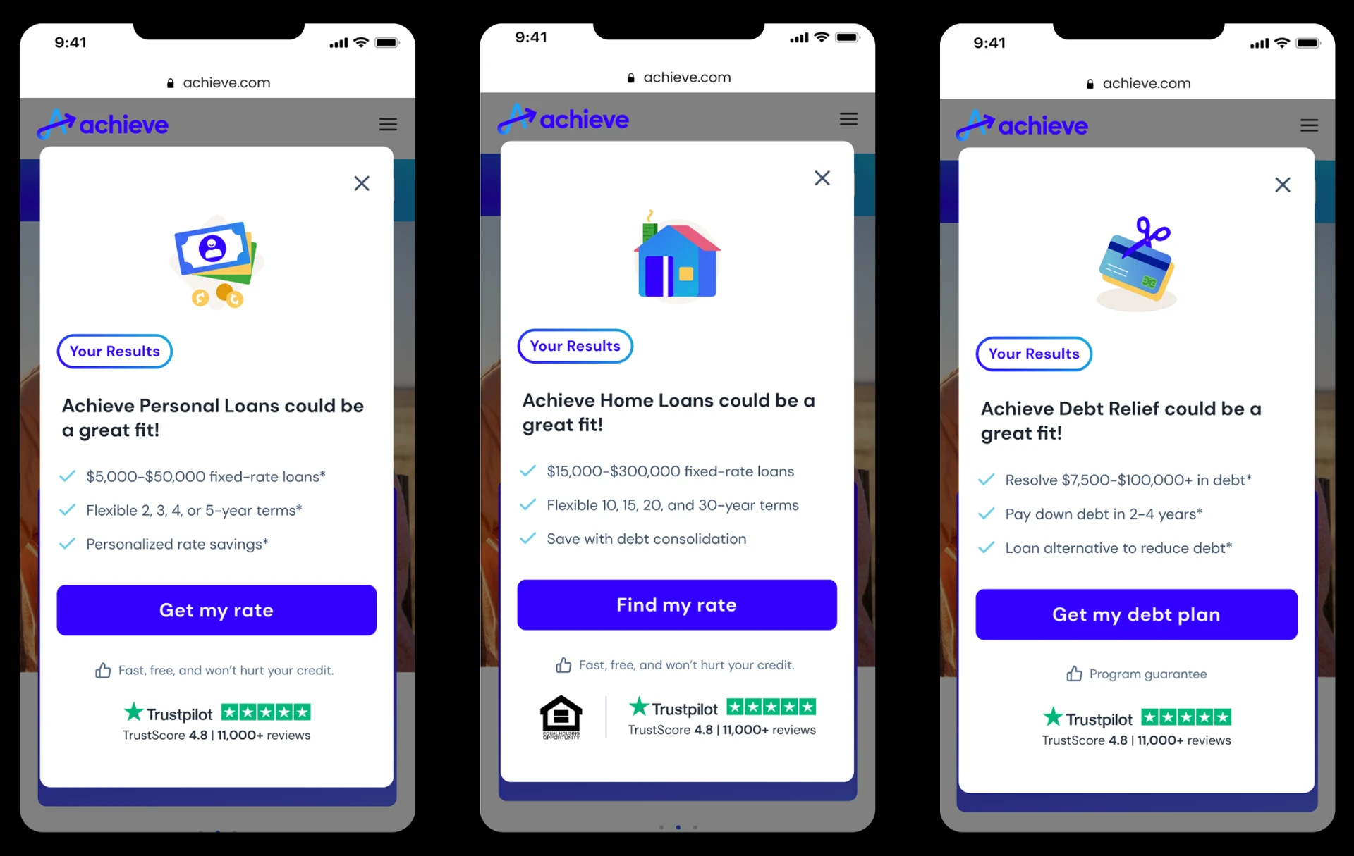
High-intent acquisition is about helping people make the right decision.
Designing under regulatory and emotional constraints took restraint, systems thinking and close work across growth, data, content and engineering. The foundation still supports growth across Achieve's products.